Animating hamburger menu icons
31 Jan 2024Hamburger menu icons transforming into a close button are everywhere. Some are animated, some are not. One thing that always disrupts me is when the animation does not make any sense. When one of the three bars get animated away using opacity for example. Where does the bar go?! Welcome to this small rant on hamburger menu icon animations that includes a proper solution in the end.
What's out there?
There's three categories that I divide hamburger menu animations into:
1. No animation
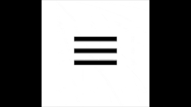
No animation is better than a bad animation in my opinion.
2. Vanishing bars
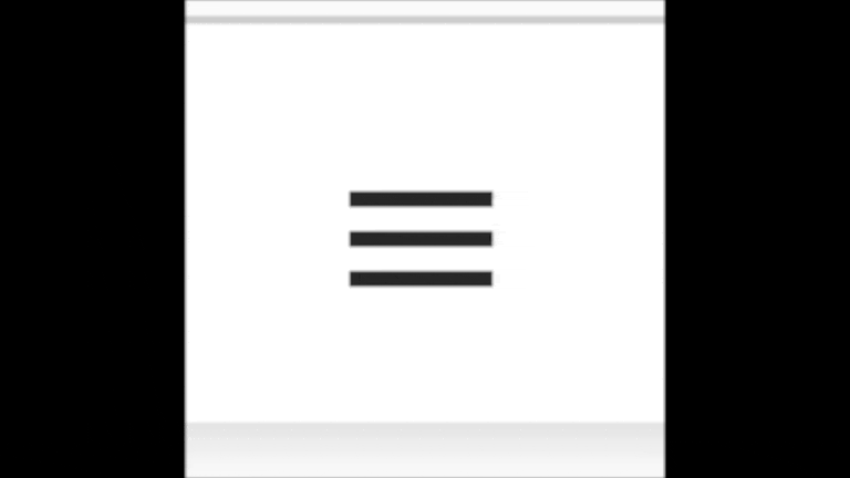
When I see this animation I always think: "Where do the bars go?!"
3. Animations that could be possible in real life
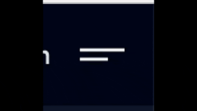
These are the animations I love. Something is happening to the bars that could be reproduced in real life by playing with a camera angle an moving the bars for example. These animations will make me click the hamburger icon a couple of times to visualize what is happening.
My take
This is my take. It is one more implementation of an animation that could be possible in real life or that could be explained by the laws of physics.

Do you want to play around with it yourself? See the code below!
<!DOCTYPE html>
<html lang="en">
  <head>
    <meta charset="UTF-8" />
    <meta name="viewport" content="width=device-width, initial-scale=1" />
    <title>Animated button icon</title>
    <style>
      :root {
        --bar-height: 10px;
        --bar-space: 12px;
        --transition-duration: 0.3s;
        --transition-step-duration: calc(var(--transition-duration) / 2);
      }

      html,
      body {
        height: 100%;
        margin: 0;
      }

      body {
        display: flex;
        align-items: center;
        justify-content: center;

        background-color: #82a7a6;
      }

      .button {
        position: relative;

        display: block;
        width: 100px;
        height: 100px;
        padding: 0;

        background-color: transparent;
        outline: none;
        border: none;

        cursor: pointer;
      }

      .button__bars {
        position: absolute;
        top: 50%;
        left: 50%;

        display: block;
        width: 74px;
        height: var(--bar-height);

        background-color: #fff;
        border-radius: var(--bar-height);

        transform: translate(-50%, -50%);
        transition: background 0s var(--transition-step-duration);

        &::before,
        &::after {
          position: absolute;
          left: 0;

          display: block;
          width: 100%;
          height: var(--bar-height);

          background-color: #fff;
          border-radius: var(--bar-height);
          content: "";

          transition-delay: var(--transition-step-duration), 0s;
          transition-duration: var(--transition-step-duration),
            var(--transition-step-duration);
        }

        &::before {
          top: calc(-1 * (var(--bar-height) + var(--bar-space)));

          transition-property: top, transform;
        }

        &::after {
          bottom: calc(-1 * (var(--bar-height) + var(--bar-space)));

          transition-property: bottom, transform;
        }
      }

      .button--open {
        .button__bars {
          background: none;

          &::before,
          &::after {
            transition-delay: 0s, var(--transition-step-duration);
          }

          &::before {
            top: 0;

            transform: rotate(45deg);
          }

          &::after {
            bottom: 0;

            transform: rotate(-45deg);
          }
        }
      }
    </style>
  </head>
  <body>
    <button id="button" class="button" type="button">
      <span class="button__bars"></span>
    </button>
    <script>
      const button = document.getElementById("button");

      button.addEventListener("click", () => {
        button.classList.toggle("button--open");
      });
    </script>
  </body>
</html>
Conclusion
Do you have more example of animated hamburger icons that do not make sense or that do make sense? Share them via Twitter! I know that sometimes devs do not have enough time to think about these kind of details or simply do not care about them. Take this blog post with a grain of salt! The most important part is the functionality anyway. However, sometimes it's just really nice to nitpick over these small and often unnoticable details.
If you liked this article and want to read more make sure to check the my other articles. Feel free to contact me on Twitter with tips, feedback or questions!